
The Challenge
Students can spend 2000 to 5000 hours of their lives studying. But almost no one actually invests time in learning how to study. This can lead to a lot of stress, loss of motivation, bad grades and wasted time. So how do we learn how to learn?
StudySmart is a Dutch startup that creates methods, tools, workshops and books to empower anyone to study better. They already helped more than 200.000 students all over the globe. But their tool had some usability issues that they needed to fix in order to make learning even more easy and enjoyable for everyone. That’s why I joined their team in Amsterdam with a mission to redefine StudySmart user experience.
Embracing constraints
This project had severe challenges:
- Time limit. There was a strict deadline of 3 months for completing the project.
- People. The developers of the team were focused on other tasks at the moment, so we needed to keep any backend changes to a strict minimum.
- Resources. This was a startup creating tools for students so they need to keep their price affordable.
Good design is usually born by understanding and embracing constraints. So I accepted the challenge and joined StudySmart team in their office in Amsterdam for a 3-month design marathon!
A community of learners
StudySmart motto is “Study Together”. And that togetherness wasn’t just an empty value. No one learns anything alone. Parents, teachers, schools and even book publishers can play a big role in empowering students in their learning journey. That’s why even though their main audience was students between 14-24 years old, the team invested a lot of time creating a community open to everyone interested in learning. StudySmart hosted a lot of events from presentations about learning how to study to meet & greet barbecues where everyone had a chance to hang out in a more casual setting. They also had community managers, students that would take their time to help their peers and beta test new features. Being this close to the community was essential for understanding the student’s needs and creating the best study tool possible together.
Among the biggest pain points for students were:
- Not knowing how to study
- Forgetting what they learned
- Missing the bigger picture
- Getting the most of their time
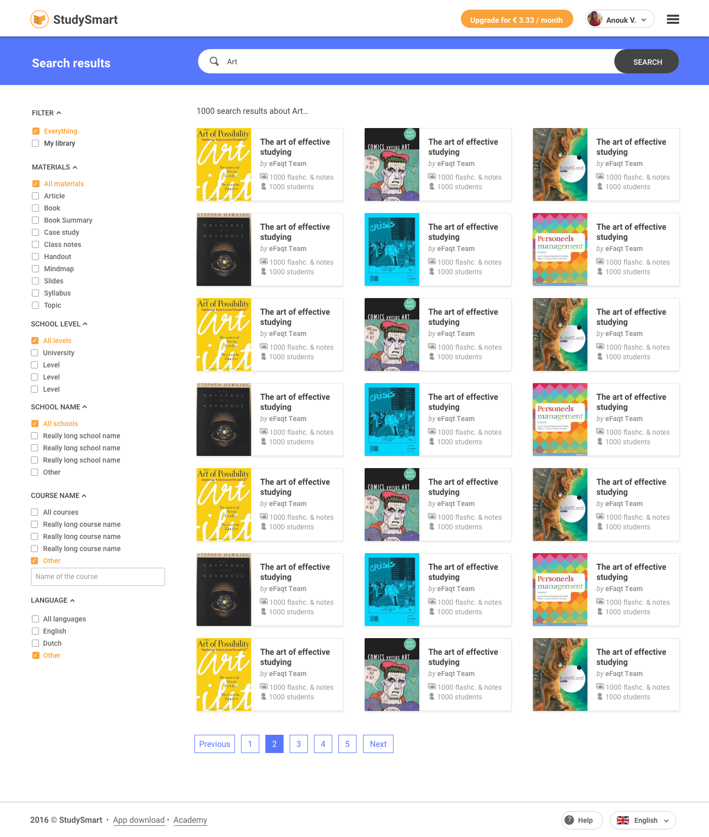
How might we organize hundreds of thousands of study materials from students all over the world?
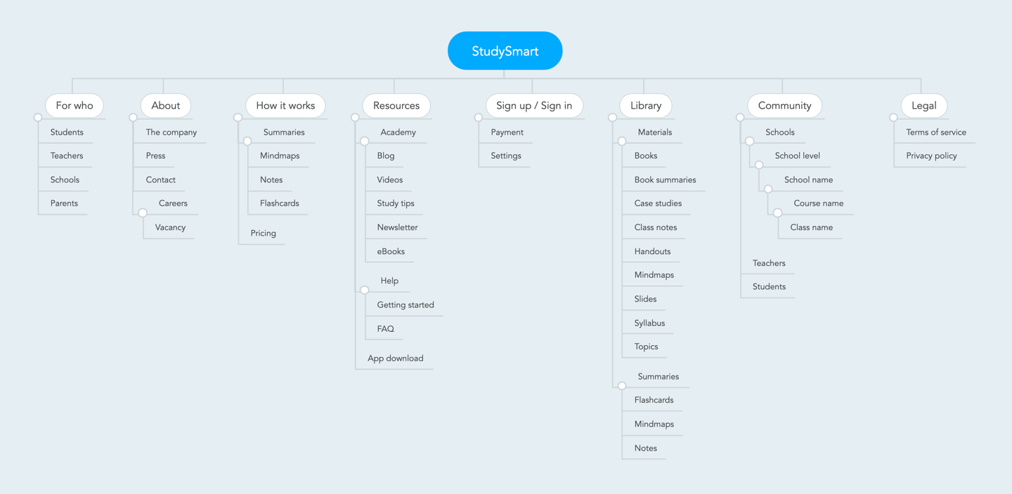
Every new user-generated content in StudySmart can become available to other students in the community. The platform is also open for schools and teachers to share content from their courses among an entire classroom. This one of the biggest value proposition of StudySmart, but when you have hundreds of thousands of flashcards, notes and summaries of different materials it can be really hard finding what you are looking for. That’s why, after deep-diving into previous user research and mapping the student’s pain points, my next step was to review the information architecture of the tool.
Learning in different ways
Everyone learns differently. For some people, writing summaries and notes is the best way to memorize information, for others is the practise and repetition that works best. But with 200.000 users, how do we personalize everyone’s learning experience?
That’s why Study Smart has different sets of tools that allow users to create and share.
Notes
Notes are the backbone of StudySmart. Students can quickly add notes using a rich editor. They can add text, change text styles, create lists, change colours, add math formulas and even add pictures (either by searching from the web or uploading their own).

Flashcards
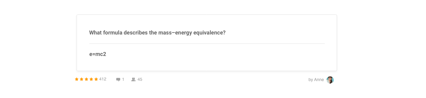
Flashcards will have a front and a backside during practice mode. Users can use flashcards as a way of asking questions, adding definitions, formula, etc. Flashcards are super useful when studying languages.
Mindmaps
Mindmaps are diagrams for organizing information visually. Since StudySmart used a map editor, I didn’t work on new designs for those.
Summaries
In StudySmart, summaries are collections of content. It’s how notes, flashcards and mindmaps are grouped in a neat topic. Students can create their summaries or use one of the +350.000 summaries available for the community (including premium summaries available for purchases). For the students that do prefer paper notes, I also designed a print editor where they can select exactly what content to print.
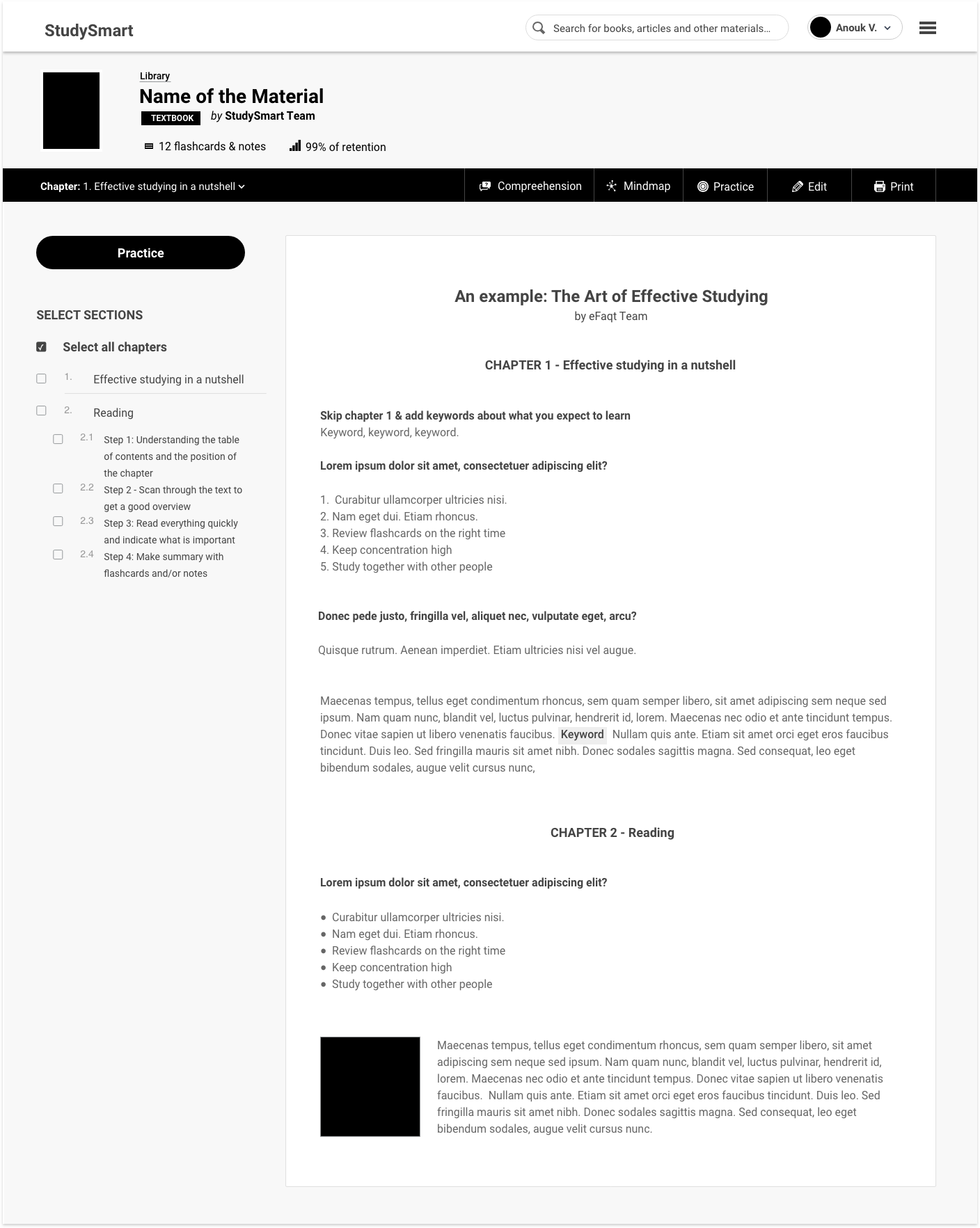
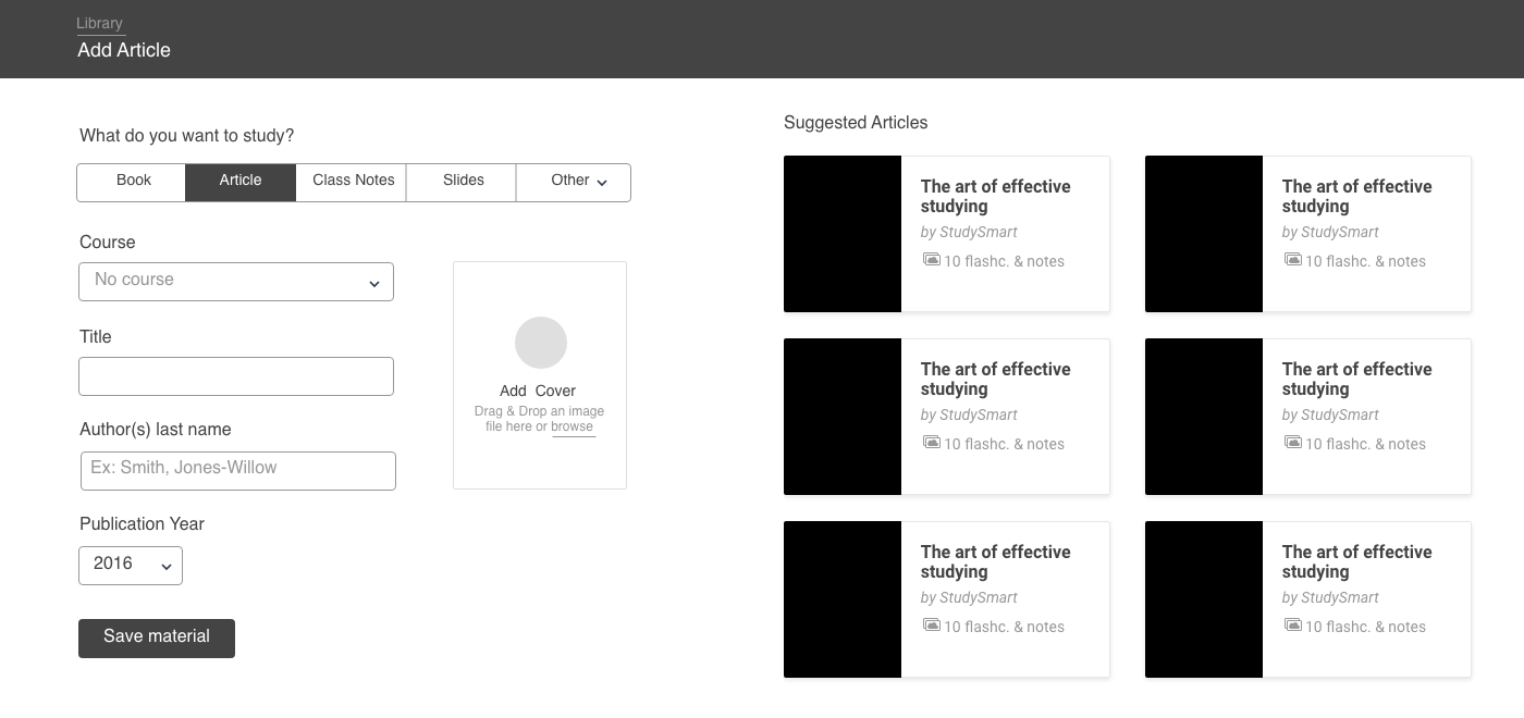
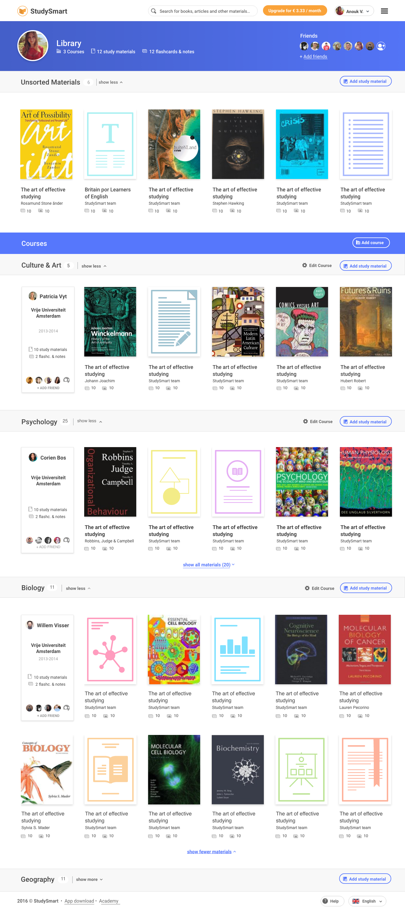
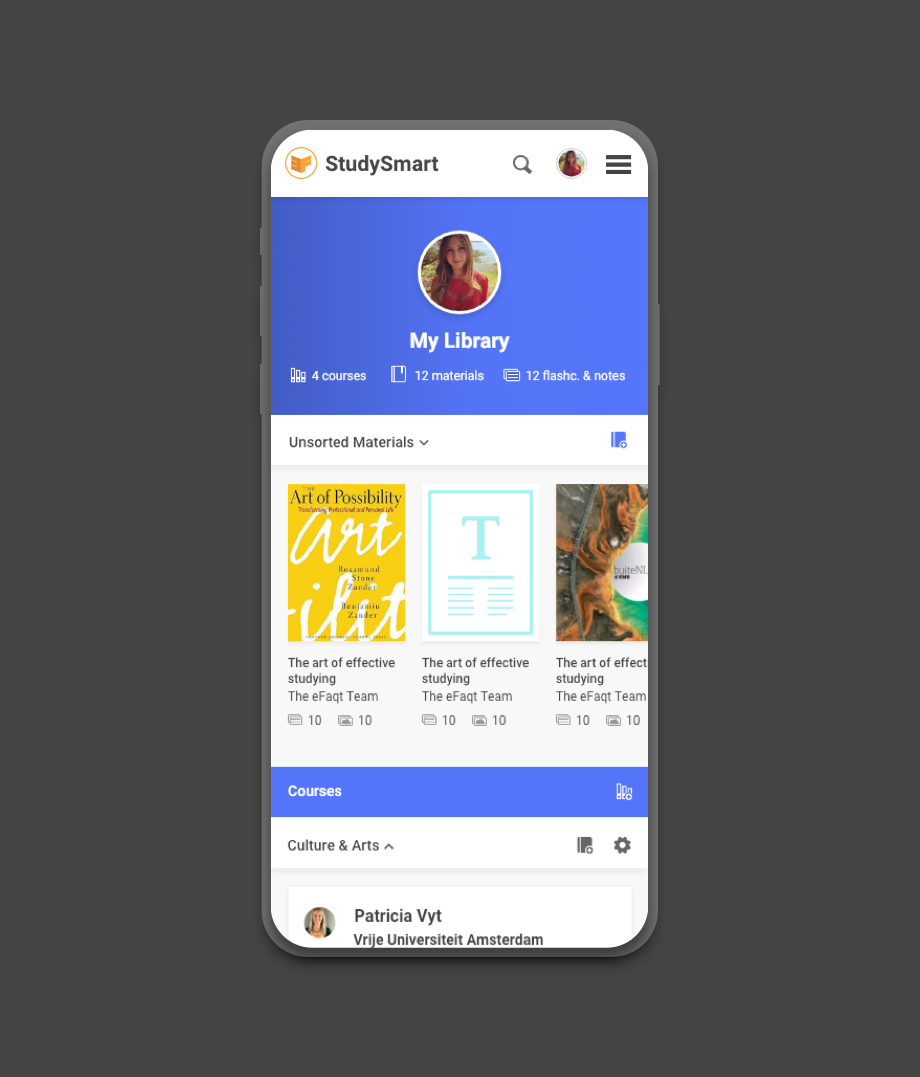
The library
The main area of the tool is a library where users can see all of their courses and study materials. Since this is a core functionality of the tool, we needed to make sure that all content was organized and easy to find. In order to do that we decided to:
- Adding a global search bar at the top of the page so users could start searching from anywhere
- Adding advanced search filters to make materials easier to sort (material type, school level, school name, course name and language)
- Adding teacher name and students avatars to the course descriptions to help classmates visually identify their courses
- Allowing courses in the library to collapse and expand to make way for new content
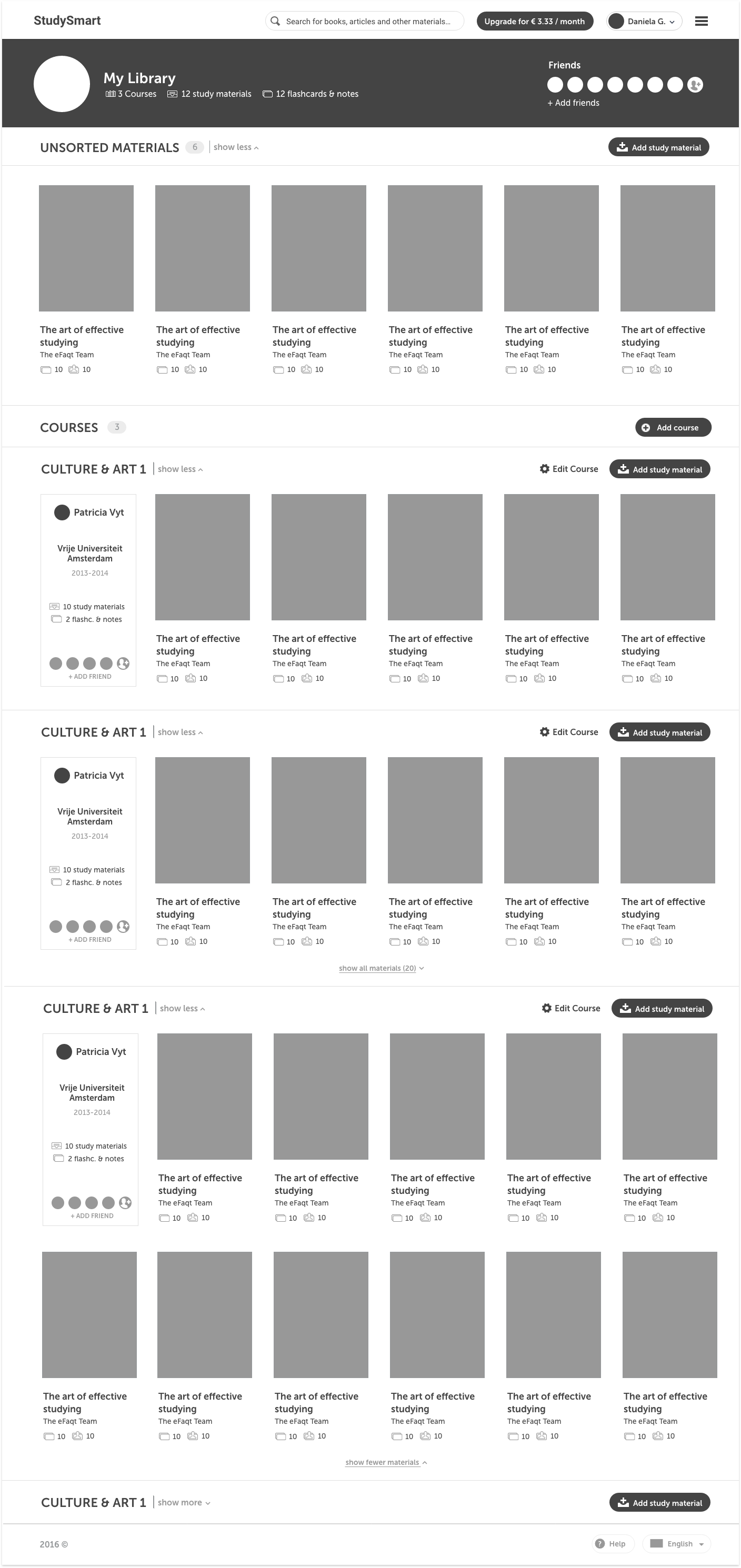
To keep all materials organized we also needed to ensure there would be no duplicated content. That’s why we decided to proactively suggest items for the users based on their course and topics. These suggestions would appear on the right side of the “add new material” screen.
There is a lot of room for interacting with others. Students can rate content, add comments and see who used their notes. It’s also possible to add as friends teachers and classmates to see everything they created using StudySmart.
Final Design
My inspiration for the visual design came from the real-life tools we use for studying: books, notes and flashcards. I wanted to create a design language that felt familiar to the students, resembling real-life materials we all know and love. The design feels like paper in some way, with the smooth surfaces, card organization layout and soft shadows… but it goes so much beyond that! You will have a library of content with infinite space that you can share with your friends to study together.
Library visual design
Practice tool
My favourite area is the practice tool. Here students can select all the content they wish to study and practice in a quiz format. After each answer, users can self-rate how well they did and see a breakdown of their answers at the end of a study session.
- Students rate each answer on a scale from 1-5
- Keyboard shortcuts are available so that students can navigate more efficiently
- During a study session, students can see how many notes & flashcards they still have left to practice
- The progress bar colours are the same used on the rating scale and help students keep track of how well they are doing in the current session
Students could also use a companion app to practice on their phones.
Resting is also essential to sediment what you learned. That’s why I also designed a break timer between the sessions. Users can select how long they wish to take a break and they will see a new tip for relaxing during this time.
Students can also decide how long they wish to practice and set reminders so they can review the content again. They can also receive notifications If they break concentration and are idle after a certain period of time. Studying is a habit, after all.
Landing pages

Since studying together was an essential concept of the tool, it was important for each study material to be easy to share with others. For this, I designed a landing page to share and receive invites. This is what you would see If a StudySmart user was to share material with you.

Style Guide
It was also super important to create documentation so the team could design new pages on their own after I left. For this, I created a design system documenting everything from colours, typography, grid, sizes and components.
Below is the style guide from the StudySmart design system.
I also designed a custom image for each material type empty state (what users see when no image is uploaded). This helped users differentiate between a book, article or course syllabus when images are not available.