In 2017 I joined an amazing team of designers, developers, product owners, copywriters, data scientist and more as part of BookingSuite, a unit of Booking.com that helps accommodation providers grow their businesses. BookingSuite helps 350,000 properties of all types and sizes take care of business, so they can take care of their guests.
BookingSuite has a wide range of products to suit different partners needs from creating a website to finding the right hospitality app. I joined the product team of RateIntelligence, a business intelligence tool created to help hoteliers manage their revenue, see insights about their local market, receive recommendations about local events and more.
During my one year at RateIntelligence I worked on several different projects as a UX Designer:
- Onboarding new partners
- Re-structuring email and messaging strategy
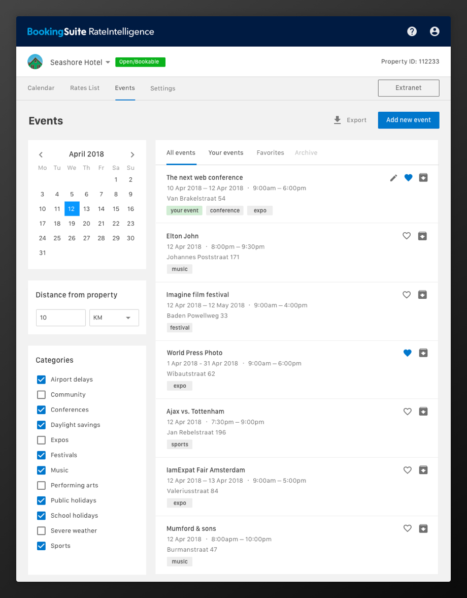
- Designing brand new features such as event listing and multiple views
- Redesigning existing sessions to fit Booking.com design system and branding
- Launching and promoting a new version of the product
- Several A/B tests experiments focused on improving engagement, clarity, and usability of the tool
Some of the challenges included creating localized content in 42 different languages and making sure our data was presented in an actionable and easy to understand way for properties of all sizes and partners of different backgrounds. And, of course, making continuous improvements to a tool partner use every day to manage their business without disrupting their workflow.
I also coordinated partner research projects inside the team. Every sprint I interviewed 5-8 property managers from around the globe to understand how they used our tool, what challenges they faced and what were the biggest opportunities for improvements we had. I coordinated everything from recruiting partners, creating research guides, moderating interviews and usability tests, analyzing research insights and presenting everything back to the teams. I was also responsible for managing surveys to collect additional information about each feature in the context of the tool and measuring partner satisfaction. I also learned a lot about the industry by talking with our internal team of revenue managers and partner support executives.
Since one of our principles at Booking is “design is a team sport”, part of my process often involved collaborating with different roles in design workshops, brainstorms, UX reviews, and design sprints. These events gave the team the chance to share all of our learnings, quickly generate and prioritize new ideas and improve the overall user experience of our tool. We would also create artifacts such as Personas and Customer Journey Maps to document research insights and share our learnings with the rest of the company. These artifacts, combined with quantitive and qualitative data, helped us uncover and prioritize what to build next. All of our decisions were informed by data and driven by empathy.
One of my favorite parts of working on RateIntelligence was been a part of BookingSuite’s design community. Although the tools we worked on were widely different, it was amazing to share what we learned with each other during our weekly meetings and design critique sessions. The personas we created for RateIntelligence, as an example, ended up been used by other tools with a similar audience.
The challenge
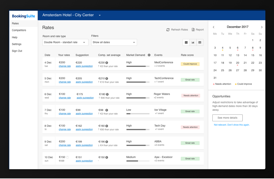
When I joined the RateIntelligence team my first challenge was to improve the usability of the main area of the tool: the rates calendar. This is how the tool looked like before I started.
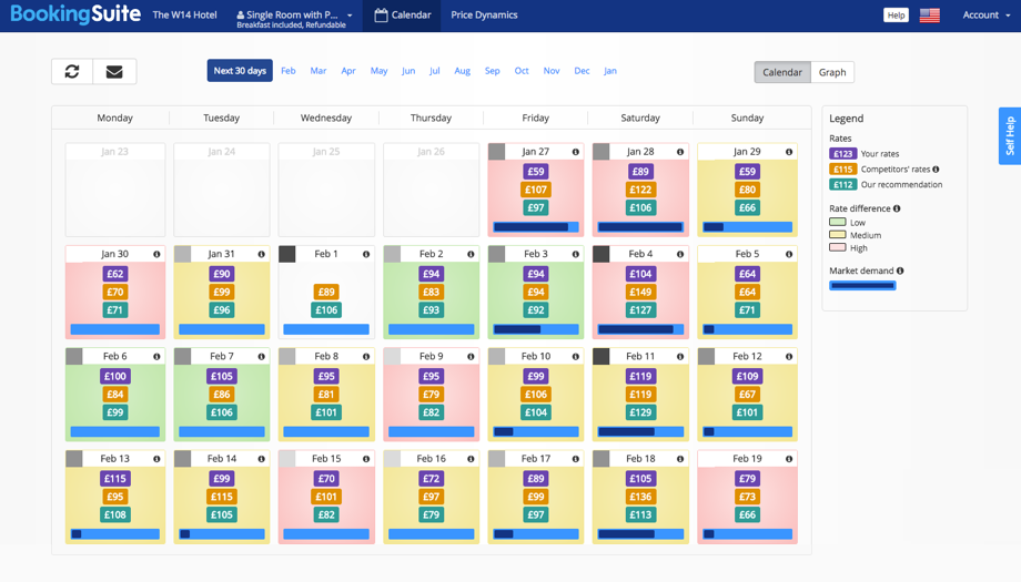
There is a LOT of information available here. Partners could see their rates, their competitor’s rates, market demand, etc. But there was just not enough space for all of this on a small calendar cell and we needed to account for 42 different languages and the local currencies! We tried iterating on several different approaches to solve this issue.
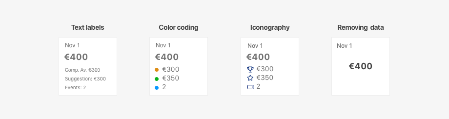
Text labels: We considered adding labels inside the cells explaining each data point. In order to fit the content in the cells, we needed to use really small text and abbreviations. This made the calendar really hard to read.
Color coding: Conveying meaning to color alone is not accessible to users with visual impairments. The partners would also attribute different meanings to the color coding, even when we displayed a legend.
Iconography: This solution was more accessible, but still was open too open to subjective interpretations. The icons also added extra cognitive load to the calendar.
Removing data: On this iteration, we moved most of the data from the cells to a sidebar that would appear when users clicked the cells. This solution made the calendar easier to scan, but created a different usability problem: now users needed to click each individual date in order to the information they could have at a glance in other versions of the calendar. That meant at least 30 clicks to read all information available in a month (multiplied by the number of rooms and rate policy types). The data was almost impossible to compare.
Designing a new view
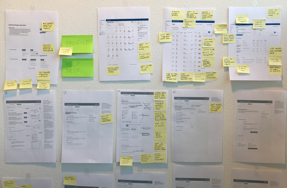
After several iterations and experiments, I still couldn’t figure out the best way to display the information in a calendar in a usable way. It was time for a bolder step! What If it didn’t have to be a calendar? I started to brainstorm different ways of displaying the exact same data points. And I arrived at a list view concept. I created some paper wireframes to explain my idea to the team.
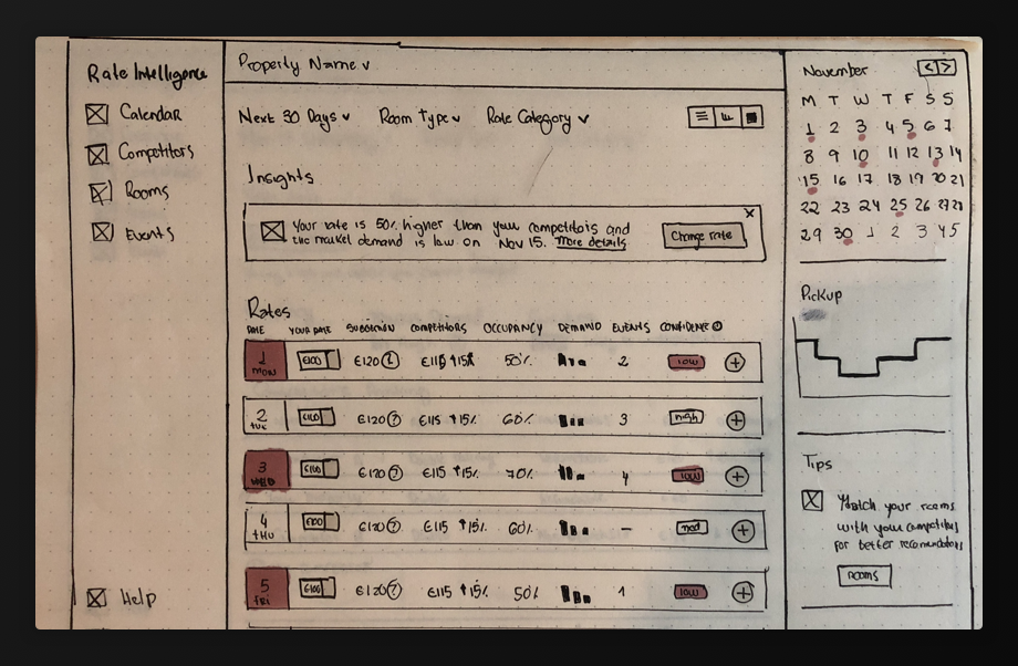
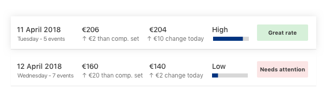
I could see several advantages to this approach:
- Clarity - no need to memorize legends or icons
- Scalability - there is a lot more space to add different data points
- Accessibility - the content was a lot easier to read and didn’t rely on colors for meaning
- Filters - since we were not constrained by a rigid month format, partners could now filter out only dates that need their attention or that had a high market demand, as an example

Final design
After collecting feedback from colleagues around BookingSuite and running usability tests sessions with partners, I made several changes such as removing the functionality to change rates (too much complexity) and using horizontal navigation instead of a sidebar (more space for the content).
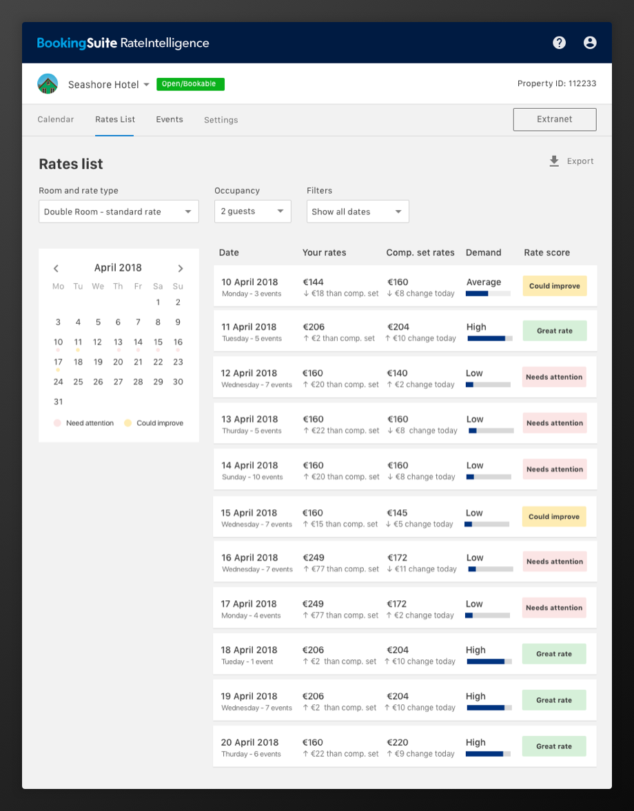
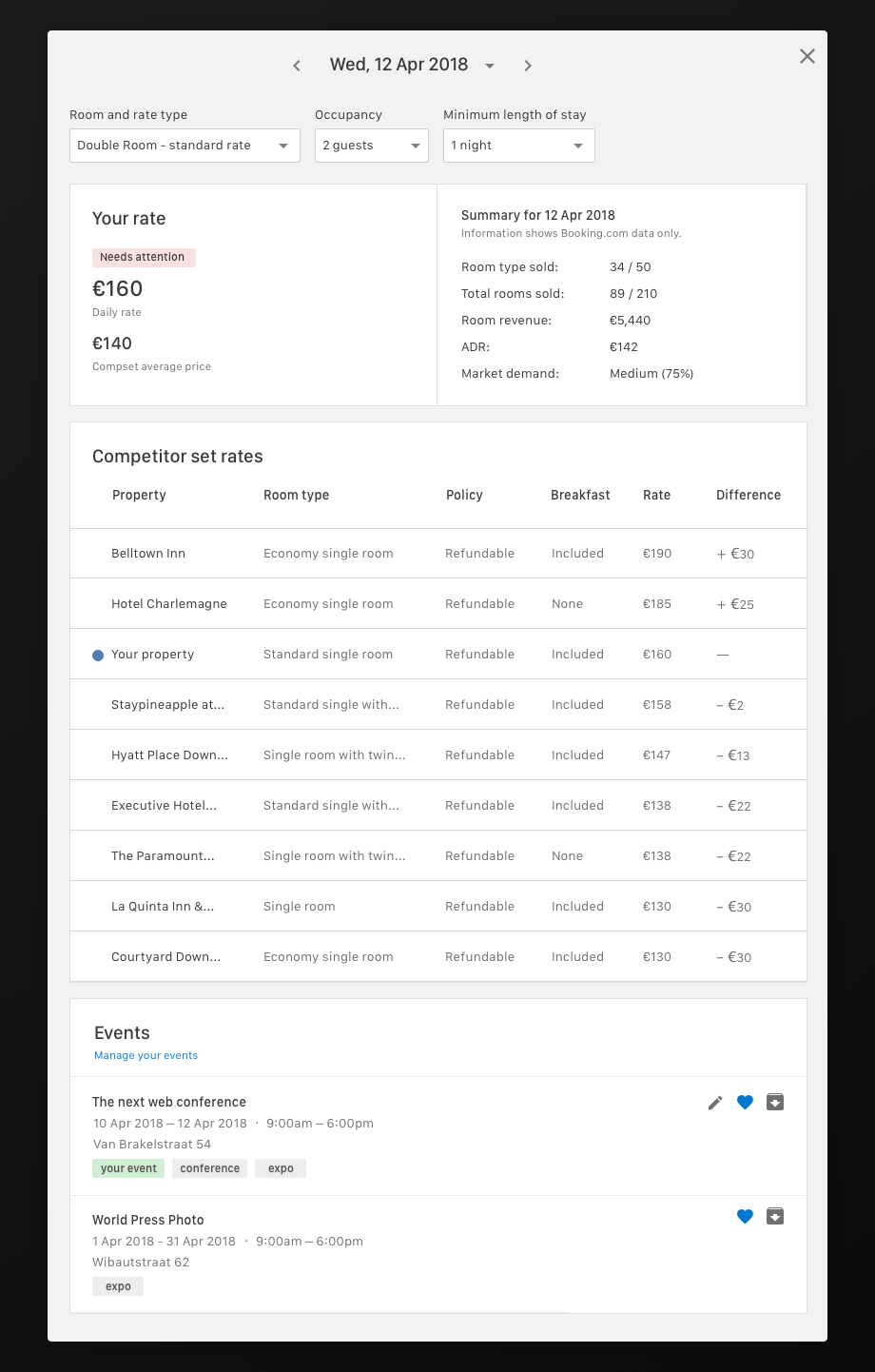
We also created a day view page that would display more detailed information about a specific date.
And a separate list for the users only interested in events.
The list view project helped partners compare a lot of different data points at the same time and quickly filter out the dates that needed their attention the most. We would still iterate on the calendar view, but we now understood that it would serve a different purpose and that for heavy data sets the list format worked best. But that’s a different story altogether…