Why hostels?
After my experience designing tools for Booking.com hoteliers, I was really curious to know how it would be like to work on the customer-facing eCommerce side of Booking.com as well. Around this time the company created a program called B.champion. The idea was to support women in tech that would like to grow into leadership positions by providing mentorship and a support group to share experiences with. It sounded amazing! There were only 3 positions available for designers, so I was super anxious about submitting my application. I was delighted when I heard they accepted it. I got the opportunity to spend 1 year in a different team and learn about a new area of the product. And that’s how I arrived at the hostel’s team!
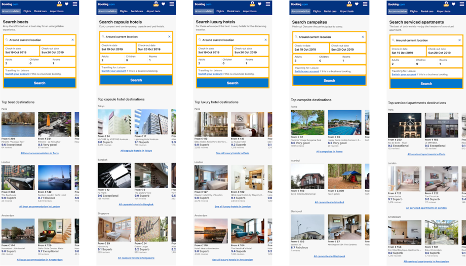
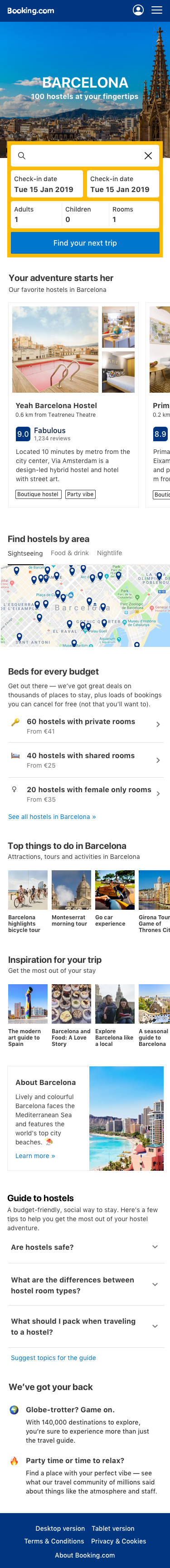
Booking.com has more than 28 million of accommodations listed. There you will find anything from hotels, to apartments, campsites, and even boathouses! But, until that point, users got a similar experience. As an example, here are the different accommodation landing pages you might find on Booking’s mobile website. It pretty much looks the same, right?
But we know that users staying at different accommodations have different needs. If you are staying at a sunny beach resort you are probably a lot more concerned about air conditioner and outdoor pool than someone going to a ski lodge. Creating segmented teams that would focus on a specific accommodation type made a lot of sense. And that was how the hostel’s team was born! It was a multi-platform team so I got to design things for the web, mobile and native apps at the same time. Yay!
Team background
When I joined the team in mid-2018 they had recently formed, but they already had a lot of information about our users and product! So during my first weeks, I took a deep dive on a lot of different data sources:
- Internal user analytics
- Results from previous A/B tests
- In-depth user interviews
- Diary studies that followed groups of travellers for 2 weeks
- Industry reports
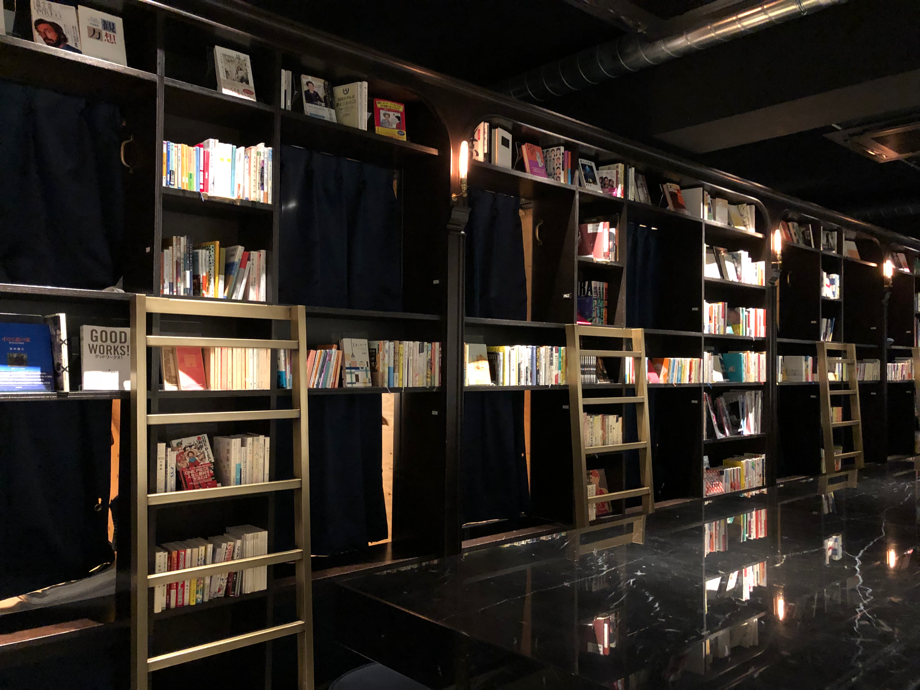
The team has also done a lot of dogfooding. This is a type of user research you do that it’s all about first-hand experiencing what our users go through (just like the people that eat their dog food to know how it tastes like). Comparing each other’s experiences was insightful to see how unique and quirky each hostel could be. I had just come back from a personal trip where I stayed at a hostel where you get to sleep in a library. I spend one night in Tokyo sleeping in a bookshelf and it was amazing! I was super excited to help the millions of Booking.com users discover unique places like this too.
Travel journey map
Ok. We had a lot of data about our users and product. How do we even start? One of the design principles at Booking.com is ‘‘keep the user at the centre of everything you do’’. And that’s exactly what I did. I started by mapping everything we knew about our users:
- Stages of a trip (from dreaming about a destination to planning, purchasing, etc)
- User needs
- Behaviours / tasks / jobs to be done
- Friction points
- Tools
This map served as a reference to identify areas of opportunity and helped us communicate our user’s point of view within and outside of the team.
So… people stay at hostels because they are cheap, right?
This is the question I was most frequently asked by colleagues from other teams over coffee breaks. After going through all the research and journey mapping exercise my biggest insight was that the answer is no. Price is not the main motivation for staying at a hostel.
Don’t get me wrong. Hostel travellers are price-conscious. They want to save money on accommodation. But they could probably do that by staying at a campsite or bed & breakfast. The reason why they choose hostels is that they want to connect with new cultures and make friends. And this is something that it’s a lot easier to do at hostels! If you go to a hotel lobby or restaurant you might notice people generally stay on their tables and interact only with their group. At hostels there is a lot of focus on socialization: there is usually an open kitchen where you can cook your meals or a game room where you can play board games with other guests. Hostels often organize other events such as parties and local tours. This makes hostels a great option for solo travellers looking to meet new people. That’s why people like to stay at hostels! Saving money is just an extra benefit. The extra cash usually went to doing more activities, experiences, trying out local food and even just travelling more often!
How is the bathroom situation?
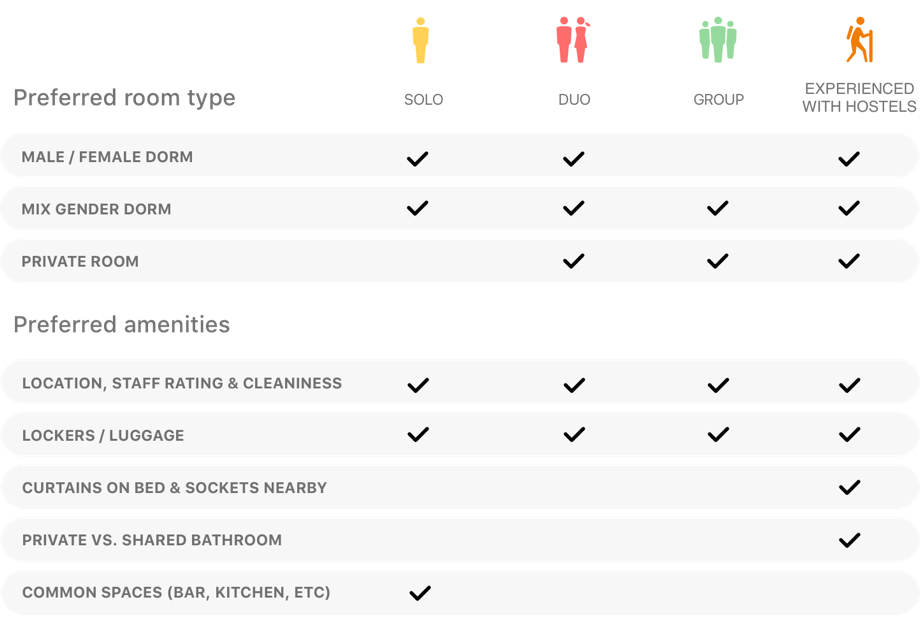
Another interesting learning was that the needs changed according to who was going on a trip. Solo travellers preferred staying at shared dorms (because that’s the best way to make friends), while couples preferred to have their private room. The needs also varied If they were hostel newbies of experienced users. If it’s your first time at a hostel you might be surprised that the bathroom is shared or that you had to bring your towels from home. Experienced travellers wanted to know a lot of details about the room like If there are power plugs available or privacy curtains near the bed. But one thing all travellers had in common was wi-fi. This was more important above all else (yes, including the bathroom situation).
Once again been able to summarize and share our learnings was essential. This time I created a few infographics to share our main findings with other teams.
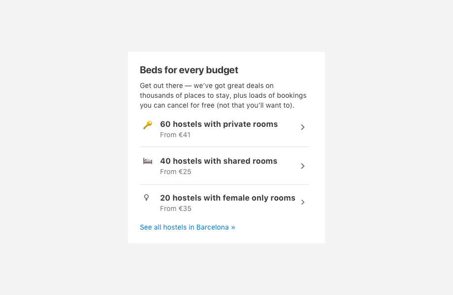
Helping travellers discover places to stay
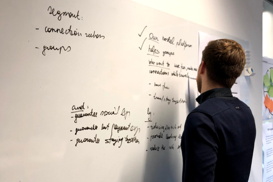
Since the user needs changes radically according to the travel group we realized that we need to make sure users had the information they needed in advance before choosing where to go. So we decided to focus on the discovery stage. At this point, we had a good idea about what users value in a hostel.
But we still needed to find what they valued in an online travel agency like Booking.com.
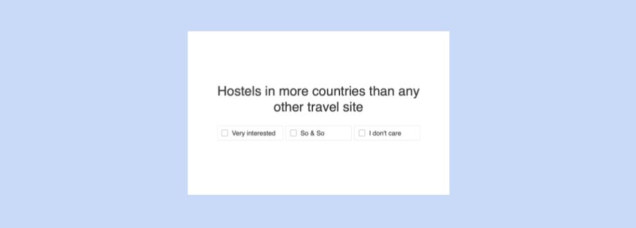
Defining what is unique about Booking.com
At this point, our marketing manager organized a meeting with everyone on the team. She needed some design help for a small project about exploring our unique selling points (USPs). It sounded like exactly what we needed so I raised my hand and volunteered to join this quest.
We set out to explore just that! We wanted to find what was our unique selling points valued by hostel travellers and how we could communicate them to users. I planned to:
- Crafting a list of USPs together with our copywriter
- Moderating brainstorm with the team possible placements in product
- Designing basic prototypes showing the USPs in context
- Collect feedback from users
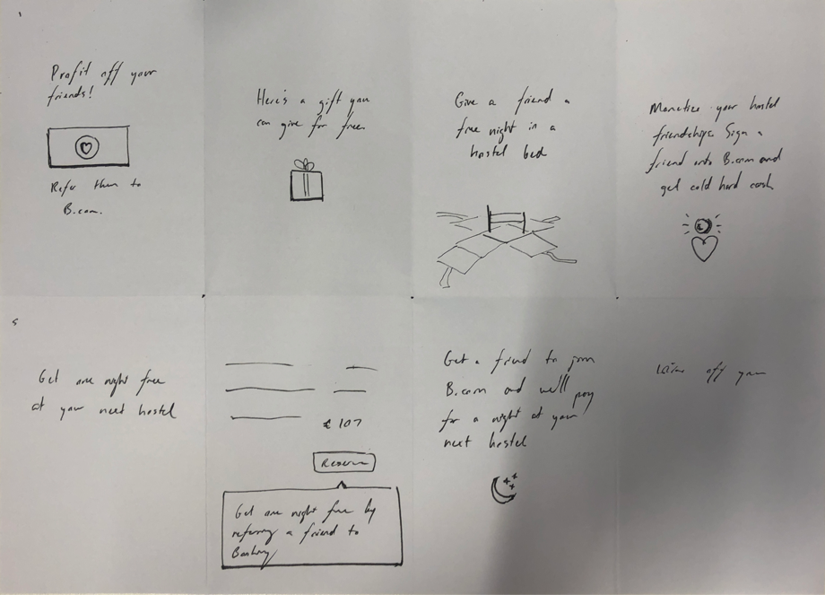
And that’s what we did. Collecting feedback was the most challenging part for me. I had a lot of previous experience with research, but it was mostly focused on UX. How do you even test something as abstract as USPs? I didn’t have long to figure out. The research trip was already booked. We were to fly to London in a couple of weeks. So we had a really short time to plan everything. The clock was ticking!
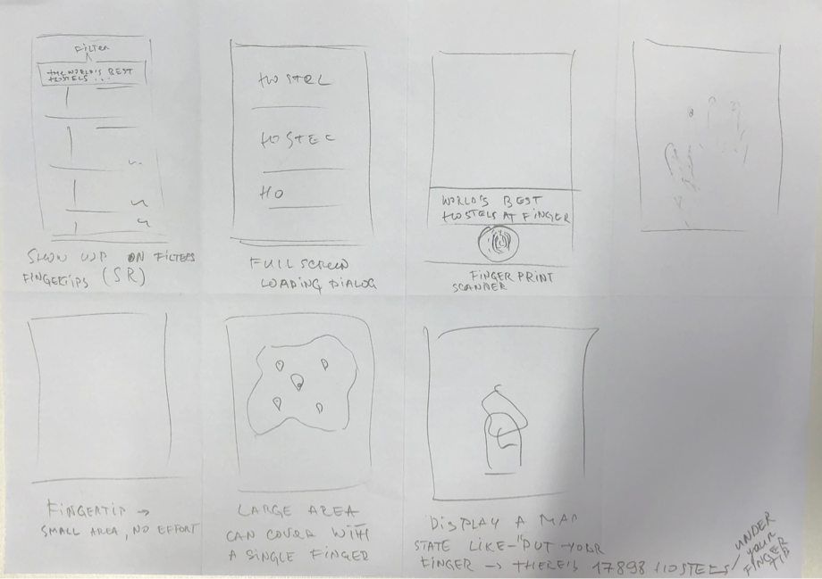
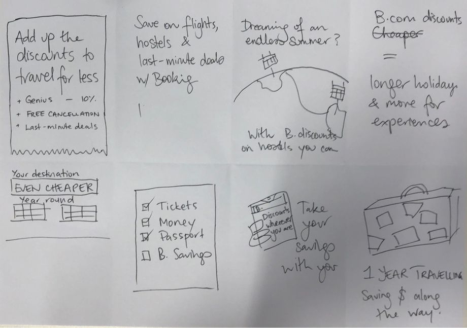
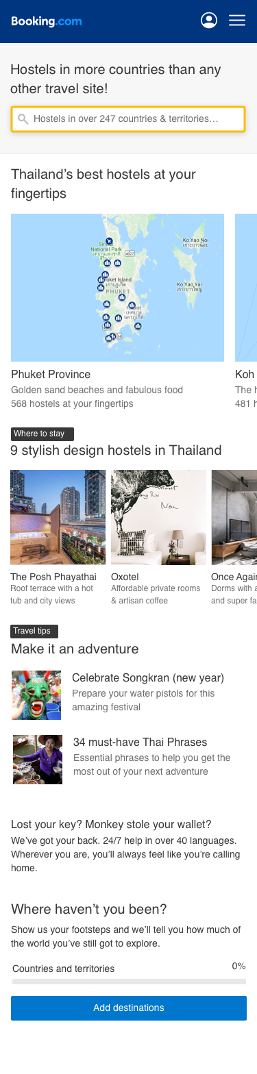
I created a prototype using our design system. I kept it super simple. Since we wanted to test discoverability, I created a city landing page experience. This is one of the pages you will get If you search for Hostels in Thailand in Google and click on of the Booking.com results. I used our current landing page designed as a base and added up the ideas the team had during the brainstorm such as a carousel that would show hostels on a map or promoting travel articles from the blog to help users decide what to do when they travelled. In the end, I created two different prototypes: one focused on destinations and another focused on saving.
Testing, testing, testing!
It was time to plan the research. The marketing manager took care of the recruiting and setting up the lab. The lab itself was super nice. It even had one of those two-way mirrors so users don’t need to look at whoever is taking notes frantically.
I created the discussions guides, designed prototypes and assets, interviewed all users, and compiled all learnings.
First I wanted to get the feedback from users for the sentences outside the context of the product. What I did for that was to print them out on a piece of paper. And ask users to rate each phrase. This led to an open discussion about why they rated each sentence as they did.
We also did card sorting to see how they would order offerings such as ‘’Free cancellation’’ and ‘’24 hours support’’ according to what they valued the most. And lastly, I tested my two prototypes.
It turns out we were boring…
Users were interested in our USPs, but they didn’t like our communication style. Staying at hostels is supposed to be fun, but we were using a sales-oriented tone that was no appealing to them.
No one wants to look at empty hostel rooms. They wanted to feel excited about travelling and to find out what is unique about each place. Without a content strategy, we would not be able to make an impact!
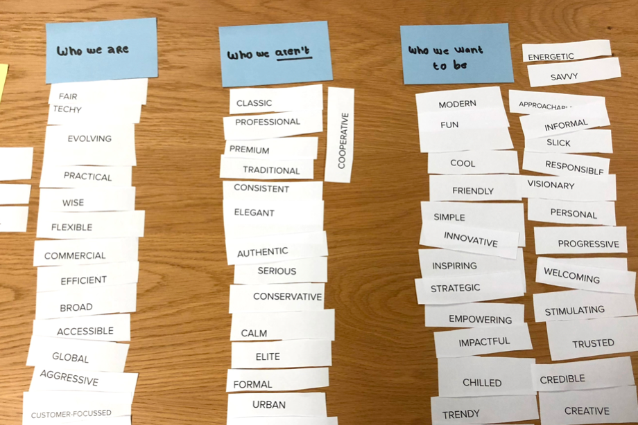
Value Proposition & Message Hierarchy
After collecting the insights from our research, I teamed up with our copywriter to moderate a value proposition workshop. The idea was to bring everyone on the team together to define our core message that we wanted to communicate with users.
Here is what we did at the workshop:
- Empathy mapping exercise where we got the chance to get alignment on what we now knew our users valued.
- Card sorting exercise to define who we are, who we are not and who we want to be
- Value proposition sentences brainstorm to summarize it all in one sentence
- Message hierarchy to define primary, secondary and tertiary messages we wanted to convey in our design
After the workshop, I collaborated with our copywriter to define a hostels tone of voice. It wouldn’t deviate from Booking.com’s standard tone of voice, of course. It would still need to feel cohesive with the rest of the company. But with a hostels twist!
Testing a Tone of Voice
Now that we had a hypothesis of what we wanted to say it was time to test them out! For that, I created one single email template and we changed the style of the copy to experiment with different tones. One was the standard tone of voice, the second one was a bit more conversational and the third was completely informal. We even used emojis! I also varied the style of the images. On the first one, I used our standard empty room images, on the second I used images of common areas of the same hostels and on the third one images showing other guests socializing.
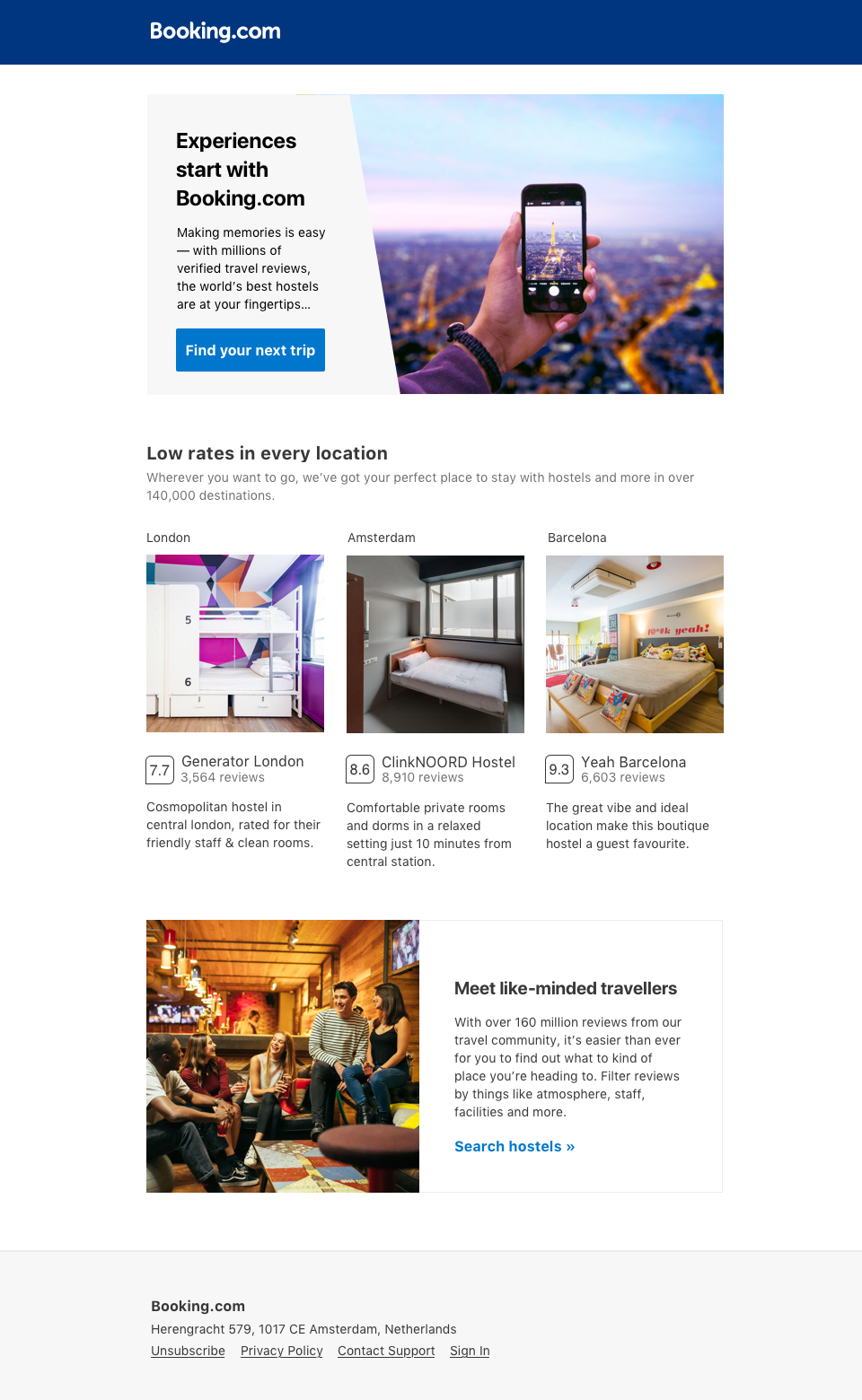
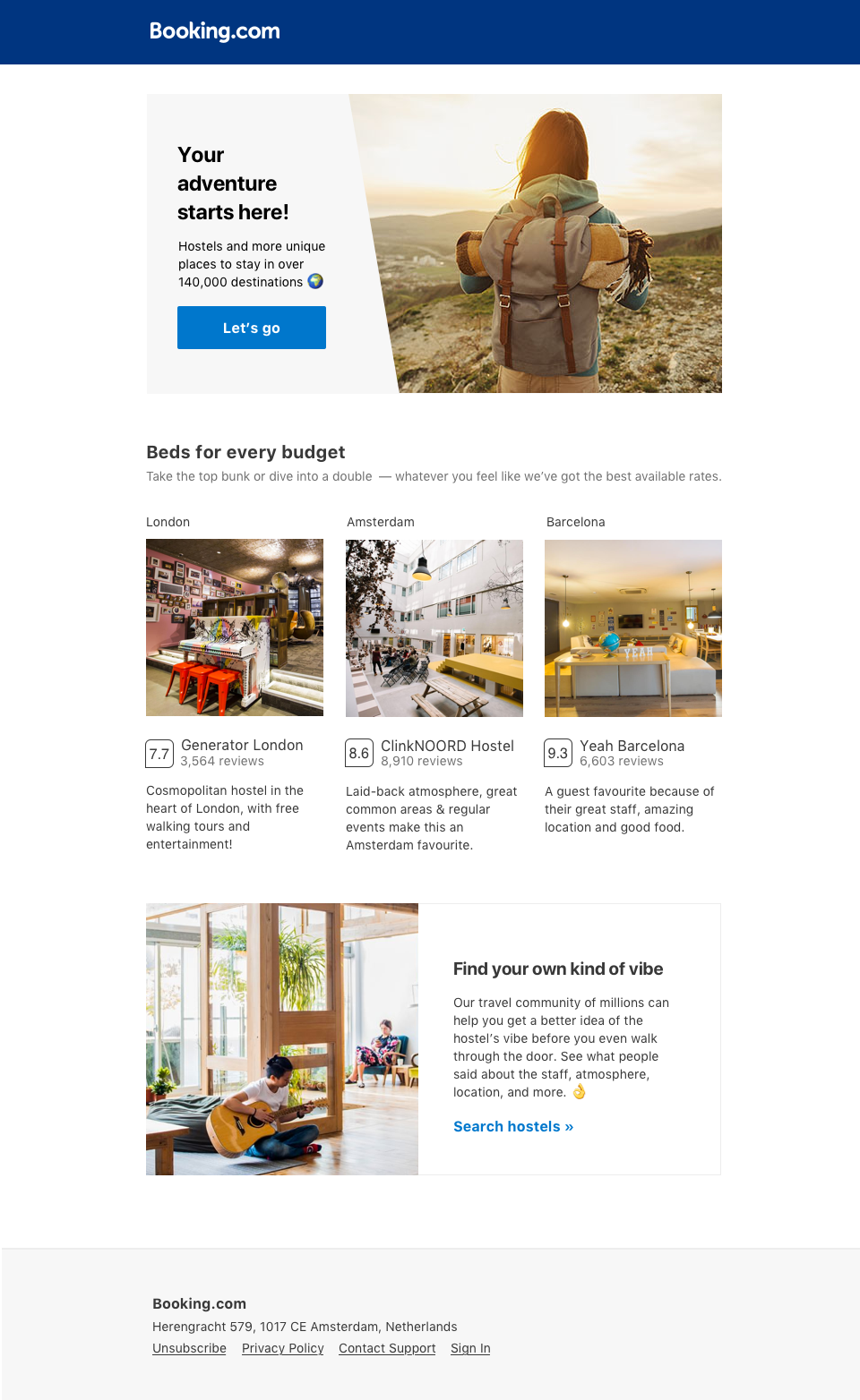
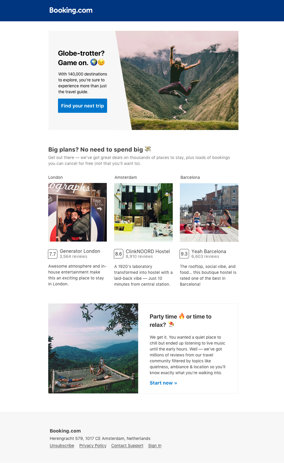
Can you guess what version our guests preferred? If you said the third one, you guessed correctly! They rated the tone as a lot more friendly and exciting. The next step was implementing it in product!
How do we scale this?
Now we knew exactly what we wanted to say and what type of images our guests wanted to see. But handpicking images for millions of properties is not scalable! So we collaborated with our data science team to create a machine learning modal that would find, among the images we already had, the more social ones.
Now we could show those images in places like search results or hostel gallery images.
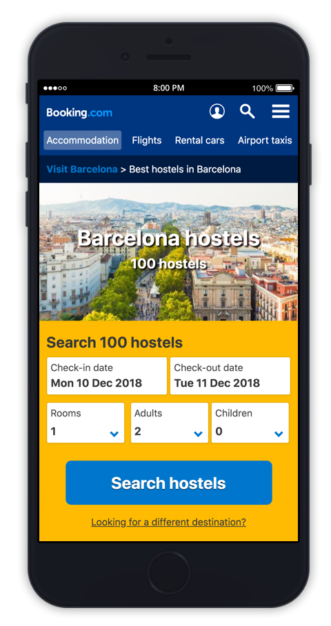
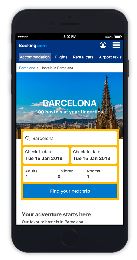
Designing the mobile landing pages
Finally! It was time to start implementing those learnings in the landing pages. Since our users were booking on the go we decided to start with the mobile web. We also explored at this point redesigning our landing pages for travellers that didn’t have a destination selected (our ‘‘general’’ landing pages).
Wireframes
High fidelity mockups
In the end, we decided to focus only on the destination experience since the demand for the general pages wasn’t high.
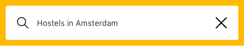
Header and search bar
On the previous designs users needed to click on a link and move to a different page to change the destination. To simplify that I added a destination input field already prefilled with the current destination, but allowed users to click on the X icon and change to a different city.
Even considering the form had an extra field I was able to ensure the search hostels call to action was visible on smaller devices by moving the form itself on top of the header.
I also did some general usability adjustments like changing the breadcrumbs to a white background to improve readability.
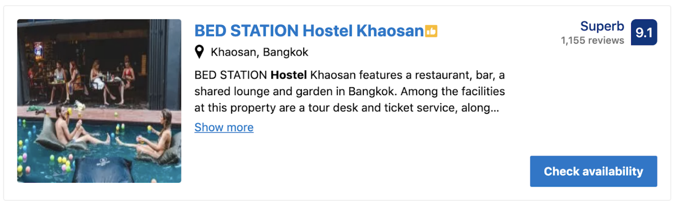
Hostels carousel
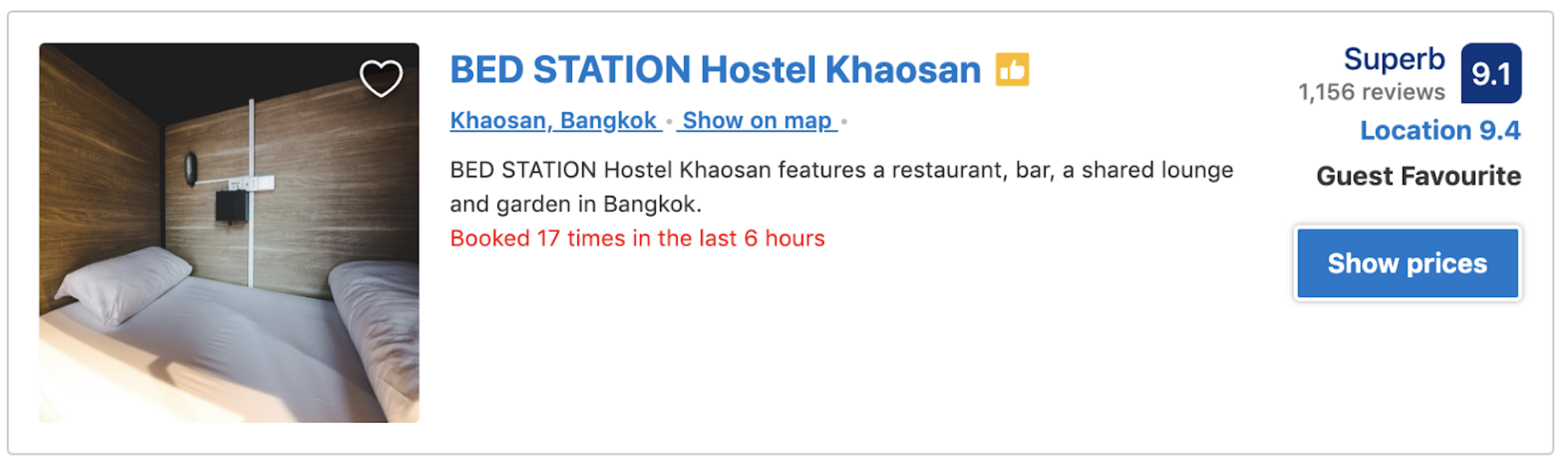
Since our users valued the images, I wanted to make sure they could view each hostel in details before even clicking on the thumbnails. For that, I created a property card showing 3 images (instead of the standard 1).
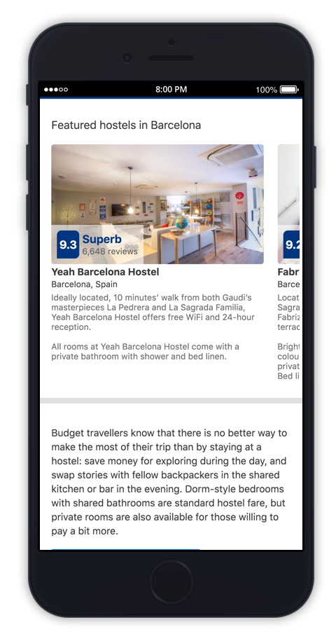
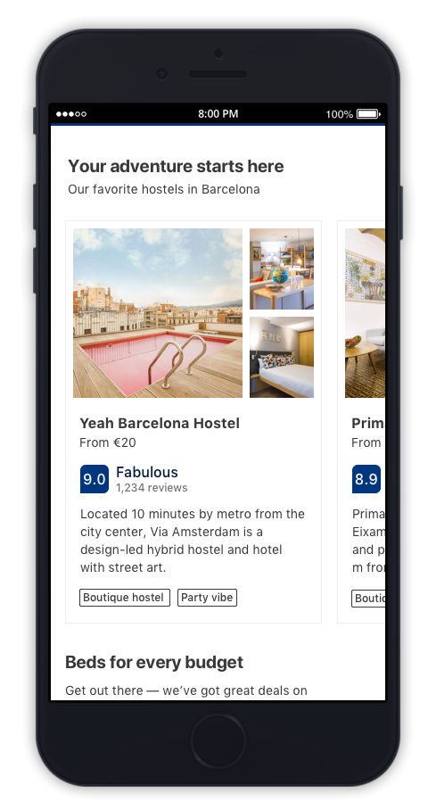
Our reviews are one of the most important aspects when deciding where to stay. So I moved the review score to a more visible location.
Pricing is also important, so I added this information to the new carousel.
Filters shortcuts
One of the main problems our users had were filtering between private and shared rooms. Here is how it looks If you try to find those filters in the search results:
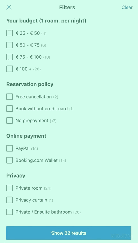
My solution was to include a shortcut to filtered results from the landing pages themselves. This way users could already compare general prices for each hostel categories before even starting a search.
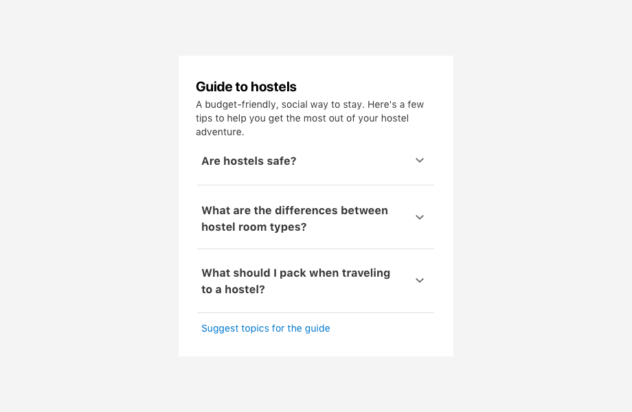
Hostels FAQ
We also wanted to make sure people that had never stayed at a hostel before knew what to expect. For this, I designed a FAQ component that would serve as an intro guide to hostels.
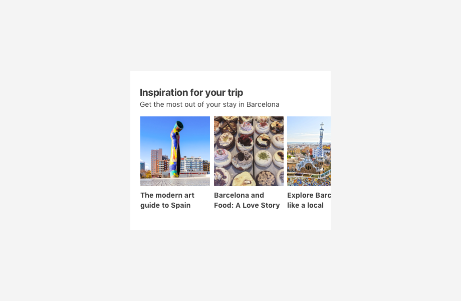
Destination tips
One of the coolest aspects of the city landing pages was been able to share local insights about each destination. Our tone of voice and research help informs our content creators about what type of articles our users might be interested in.
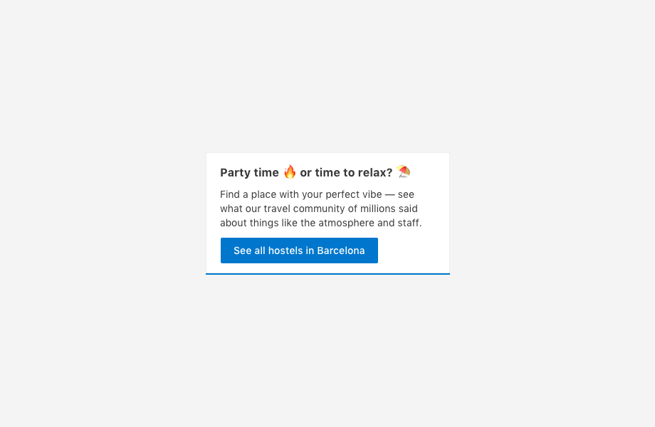
USPs in context
Finally, this is one of the blocks exclusively dedicated to our selling points. The tone is a lot more friendly and there is a clear call to action to guide our users
Results
Implementing these landing pages required me to coordinate not only with the developers and product managers on my team but with different areas of the company such as marketing, SEO, content creation, search, data science, etc. At the end not only our content strategy was successfully, but the company decided to invest even more by transforming our small 3 people task force into a team just dedicated to hostel discovery. I was also delighted when other teams inside booking were inspired by our team and started to use journey mapping to solve their own user needs.
Process overview
- Deep dive in needs, pains and jobs to be done
- Journey mapping
- Defining areas of opportunity
- Prototyping
- User research
- Value proposition and message hierarchy workshop
- Hostels Tone of Voice
- Designing email campaigns
- Image content strategy
- Designing hostels landing pages
- AB testing
- Iterating
Final Design
Here is a real product screenshot from October 2019.
If you are on a mobile device, take a look at the live page. Keep in mind that they might look different since Booking.com is always iterating on designs, but that is a story for another post.